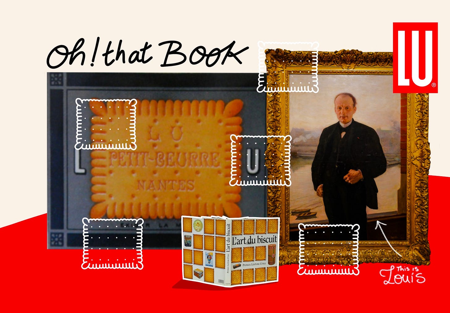
Do you know Louis Lefèvre-Utile?
🔎 Oh! Book tour: The man who redefined and activated art within the French Biscuit Brand LU
👋 Dear creative. How are you doing today?
The Art of Illustration to drive a brand, habits, and society.
While on holiday, I took a stroll and ventured into a library near my house. As I wandered among the old and new books, I came across one that seemed to call out to me. It was a book about biscuits from a brand I had known all my life but never thought much about until that moment. This book turned out to be a treasure, and today, I have decided to share it with you.
✦ Did you miss the last post? It was about my back to Substack.
☕ Grab some tea or coffee and let’s go!
Oh! Book
Creative awe
Song of the day
Louis Lefèvre-Utile: The artist behind the LU brand
LU, short for Lefèvre-Utile, is a renowned French biscuit company created in the 19th century. The name is a combination of the surnames of the founding couple, Jean-Romain Lefèvre and Isabelle Utile. They opened their first pastry shop in Nantes, and what followed became history. Their story is one of a family business, a recipe for success, and a shared ambition to captivate and delight their customers.
Early on, they created a world around their unique biscuits. A world of images and craftsmanship that complemented the quality and excellence of their products. They understood the power of images to capture an audience. They knew how to create an experience of taste and wonder in their shop and everywhere their name was called. ‘‘If you want a biscuit, choose LU’s quality biscuits’’, was one of their taglines.

After the founders passed away, their youngest son, Louis, who had worked alongside his father to learn the craft, took over the company. He propelled the vision from France to international fame. For me, such mastery is linked to the mind of an artist. He was a man who used art to its fullest potential to embody and grow the LU brand.
Book tour: the story of the LU early universe
✦ A book tour of 18 minutes.
Illustration is everywhere, it screams craftsmanship
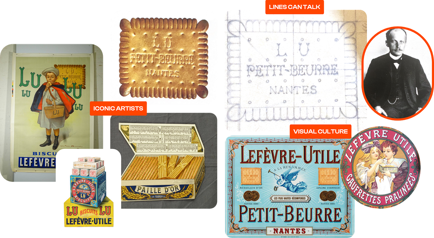
Now leading the company, Louis Lefèvre-Utile began by imagining new biscuits. One of his creations changed the story of his family’s business. He developed the iconic "Petit-Beurre LU," which became an outstanding success. The initial sketches and crafted details expressed a vision of innovation and play. Like an engineer, he ensured every corner had a function and served the purpose of enjoying the quality biscuit. From product design to lettering and typeface, he created his first best-selling product. One who became an ambassador of his unique style and artistic leadership.
💪 3 takeaways from Louis Lefèvre-Utile’s legacy
Everything started with a sketch
When I saw that initial sketch and how detailed it was—simple yet effective—I could see beyond its biscuit form. It was a piece of design, perfectly measured and balanced. It reveals a thought process and how deeply engaged Louis was in creating this new best-selling product for his family business. In many ways, it embraced the playful spirit of the craft. Everything about this iconic form exudes playfulness and audacity.Behind every iconic image, there is an artist
The imagery of the early LU brand is vibrant. Each biscuit had its own identity, playful form, and unique references. Louis Lefèvre-Utile imagined collections and packaging designs. Each of these innovations was adapted to each family of biscuits. The product itself was art, so it required art to showcase it. Famous illustrators like Alphonse Mucha, Firmin Bouisset, and more created posters, tin covers, and more to celebrate the LU culture.An archive of Art and the growth of a business
The company was well-established in Nantes, with a vast factory and many shops. Louis Lefèvre-Utile commissioned artists to capture the company's growth. It initially included illustrations of the factory but later evolved into a collection of photographs. The goal was to document the various transformations of the company. The collection included iconic posters, patterned packaging, sketches, and models. They became part of LU’s visual story for generations to come.
A vision including art and craftsmanship
Louis Lefèvre-Utile did not achieve the international success and recognition of the LU name on his own. His deep understanding of marketing and long-term legacy was built upon the mind of an artist. His family knew early on how to craft images that were unique, bold, and told a story, with LU biscuits as the main characters. Louis solidified that artistic DNA and cultivated a network of artisans who elevated the art within the brand and enhanced the experience for customers. Eating a biscuit was not just a commodity; it was a luxury, yet one accessible to all, from the schoolyard to high-society tea sessions. They succeeded in weaving LU into the fabric of French daily life and establishing a visual style that resonated with an era and its people.
There is so much to say about what this founder was able to create as a universe around the LU brand. It gives back its ''Lettre de noblesse*'' to a whole field. Indeed, illustration is at the center of this communication and language. Illustration has always played a pivotal role in the marketplace. These pioneers used art and design to capture the attention of customers. This serves as a reminder to illustrators who doubt their importance in the communication process.
*Letters of nobility

As in every story, time changes, and so does the language. Today, the LU brand belongs to a mastodon American brand. Its imagery relies on pictures, 3D models, and some illustrations. I must say that knowing what I know now about their early illustrative language and art, it’s like night and day. The bold and intricate designs of those days gave spark. It must have been a visual treat to have a packaging featuring the work of Alphonse Mucha, knowing how popular his art was in the landscape.
The other day, I went grocery shopping and saw the latest packaging from the LU brand. I remembered the designs I saw in this book and thought, "Wow! Time flies."
Pour susciter la gourmandise, rien de tel que de séduire l’œil.
To stimulate the appetite, nothing is better than to seduce the eye.Louis Lefèvre-Utile
This piece could have been in Your Branding Letter, and I think I will write a specific version focusing on branding. However, due to its lineage in illustration and art, it also has a place here. From the imagery and diversity of the biscuits to how far an idea can be stretched, all are incredibly inspiring and exude creative leadership.
🤩 Creative awe
🐑 The creator and his team (A hilarious interpretation of the creative process and its approval from a Goddess perspective.)
🌱 Artists do not fear… (Visual detox doesn't mean less art; it means more meaningful art in our daily spaces.)
🛋️ Color meets furniture and space (Yinka Llori's work is beautiful and joyful. It fills the space with playful imagination.)
I leave you with one of my pépites by Moloko.
Sending chill Monday vibes 🏡
Keva.


Thank you, Keva. I went to the Museum of Nantes last January and was amazed by the Lefèvre-Utile section, the illustrations and the story of the brand but most of all the incredible miniature of the factory which was a city inside the city. Unfortunately, the only thing that survived from it is one of the large towers of the gate by the docks and part of the first building which was transformed into a concert venue. I have a few photos I can share with you, if you are interested. I’m actually a huge fan of Mucha and the Art Deco style. Lots of love.